You can usually tell when a website feels professional.
The funny thing is, you may not be able to explain exactly why.
It’s rarely one particular colour, font or animation.
It’s the combination of hundreds of small decisions that make the experience feel deliberate.
Here are ten of the biggest ones.
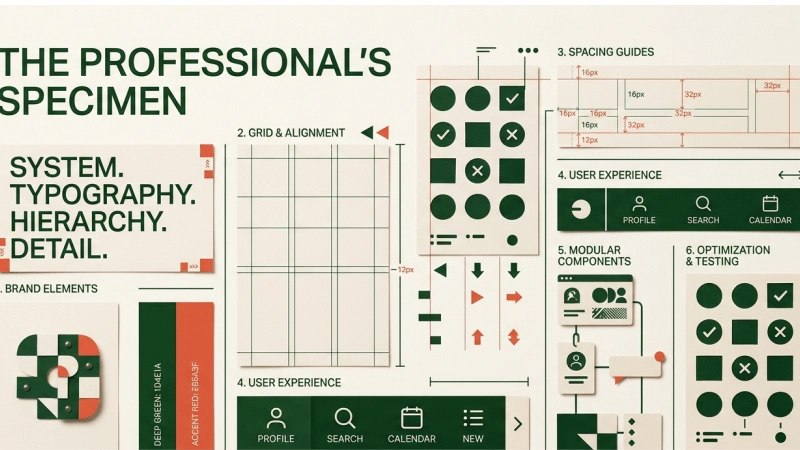
1. Clear typography
Typography isn’t just about choosing a nice font.
It’s about hierarchy.
Visitors should immediately understand what’s a heading, what’s supporting information, what’s a button and what’s body copy.
A good type system creates order.
2. Consistent spacing
Professional websites breathe.
Elements aren’t crammed together, and huge empty spaces aren’t appearing randomly either.
Spacing creates relationships.
Things that belong together should feel connected. Things that don’t should have enough room between them.
3. A clear visual hierarchy
Not everything on a page can be the most important thing.
If your headline, button, promotional banner, testimonial and navigation are all screaming for attention, nothing actually gets attention.
Good hierarchy tells visitors where to look first, second and third.
4. Quality imagery
Stock photography can work.
Bad stock photography is another story.
Your imagery should support the brand and communicate something useful.
For a business with real work to show, actual photography, project images and product photography will often create more credibility than generic smiling people in suits.
5. Consistent design
Professional websites have rules.
Buttons behave consistently.
Colours have defined roles.
Cards follow a pattern.
Headings use a consistent scale.
Icons don’t randomly change style halfway through the page.
Consistency makes a website feel intentional.
6. Good navigation
People shouldn’t have to solve a puzzle to find your services or contact details.
Your navigation should reflect how visitors think about your business—not necessarily how your internal organisation chart works.
The simpler the path, the better.
7. Strong writing
Design cannot rescue unclear messaging.
A beautiful website that says nothing useful is still a weak website.
Visitors should quickly understand:
What do you do?
Who is it for?
Why should I care?
What should I do next?
Good copy does a lot of the heavy lifting.
8. Mobile experience
Your website doesn’t get a free pass because it looks great on a laptop.
People use phones.
Menus, buttons, text, images, forms and layouts all need to work comfortably on smaller screens.
Responsive design isn’t a bonus feature anymore.
It’s basic infrastructure.
9. Speed
People don’t particularly enjoy waiting for a website to load.
Large images, unnecessary scripts and poorly optimised code can make an otherwise beautiful website frustrating to use.
Performance is part of design because the experience includes the time between clicking and seeing something happen.
10. Attention to detail
This is the hardest one to fake.
Does the favicon work?
Are the links correct?
Do the forms actually submit?
Are the hover states considered?
Are headings consistent?
Are images cropped properly?
Does the footer look finished?
The little things add up.
Professional doesn’t mean boring
There’s another misconception worth clearing up.
A professional website doesn’t have to look corporate.
It can be bold.
Playful.
Minimal.
Experimental.
Colourful.
Brutal.
Elegant.
The visual style can change dramatically from one brand to another.
What matters is that the design feels intentional and appropriate.
Professional isn’t a visual style.
It’s the result of good decisions.
And that’s ultimately what separates a website that merely exists from one that actually represents a business well.